
Front Entrance
General Info Poster
Reasons for Redesign
The location of this poster was outside and colors of the previous poster had faded from sun exposure. Also, some of the content needed to be updated and the colors and the icons did not quite reflect the RAW Center’s branding.
Past Design
Design Intentions
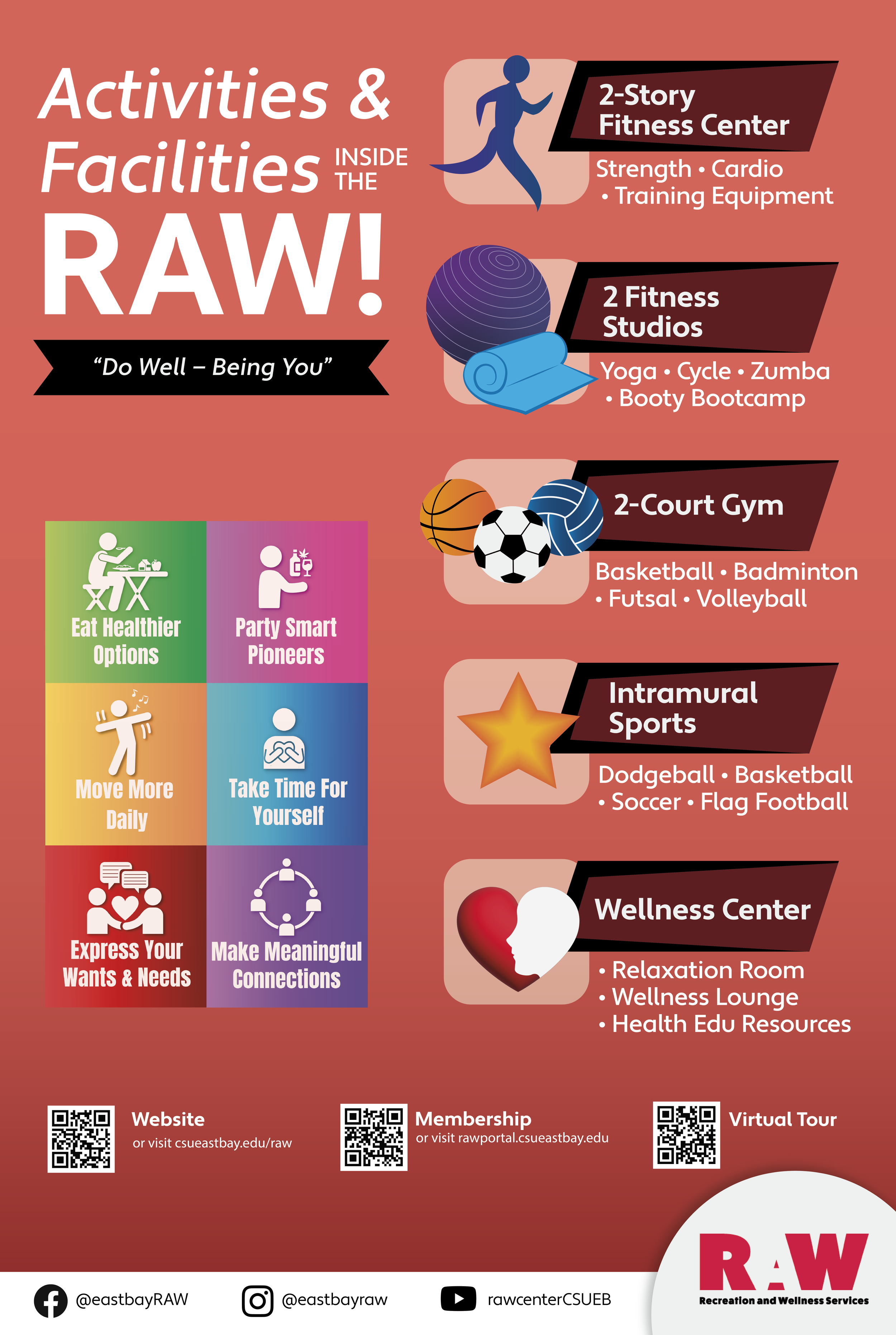
The redesign reinforces the branding of the RAW Center through its prominent red color and newly designed icons. White outlines, color, and drop shadow make the icons and other elements pop out more. Running lines and asymmetrical shapes gives illusion of movement within the design to create a sporty aesthetic.
My Redesign
Process


1st Draft
2nd Draft

3rd Draft
4th Draft
Open Rec & Drop-in Court Policies Poster
Reasons for Redesign
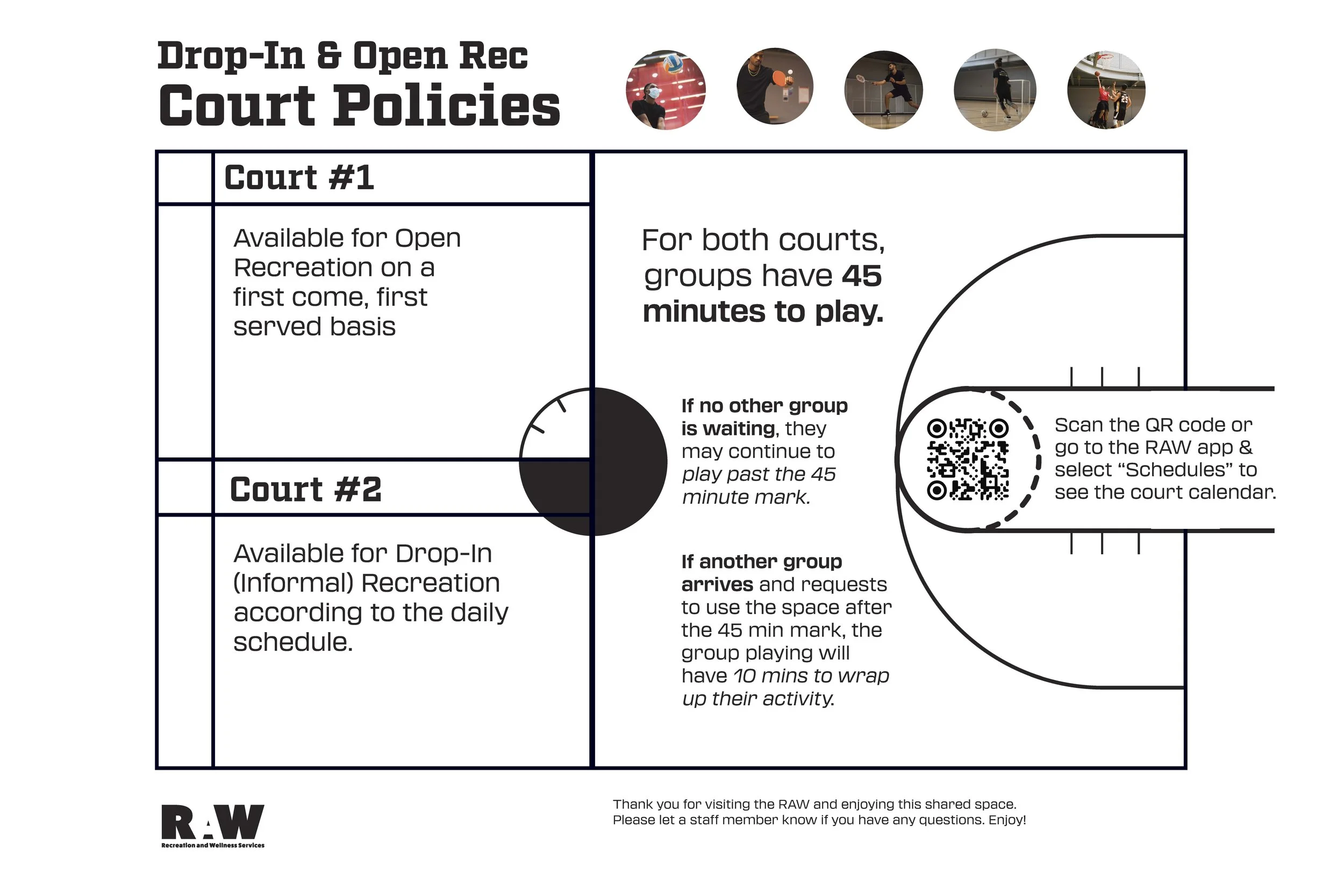
To help the operations team run the courts more smoothly, additional policies needed to be included to address common questions RAW members have about using the courts. Court numbers also needed to be added to differentiate the two courts from each other.
Past Design
Location
Since the posters are placed near the courts, it seemed appropriate to have the design resemble a court. The court composition also doubled as a table to organize the content.
Pictures
To make the picture of the person playing their sport stand out more, I made the background a monochromatic green and left the person in full color. Since there’s a lot of movement in sports, I placed labels of the pictures in an alternating pattern to have an illusion of the words moving.
Visual Eye Movement
If you notice, the people in the table tennis, volleyball, futsal, and badminton are all facing towards the middle with the basketball person facing upwards towards the court policies.
Design Intentions
My Redesign
Process

1st Draft

2nd Draft
3rd Draft