
Explore OHNOCHYS
Learn about its concepts, drafts, & design intentions
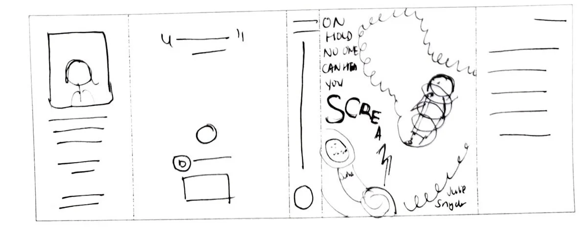
Book Cover Elements

Screaming Woman Silhouette
The silhouette represents Julie Snyder, the main character, and her frustration with the customer service of her phone service company, MCI Inc.

Phone Receiver
The phone played a major part in the story, the object in which Julie’s waking hours revolved around. It is the largest object on the book jacket and is much bigger than the woman.

Swirling Void
Julie felt helpless, stressed, trapped, and overwhelmed with no end in sight in getting her money back.
Color Scheme
The blue and orange color scheme of the book jacket was extracted from the logo of the phone service company, MCI Inc.

Three Dots Speech Bubble
The customer service was no help at all and Julie spent more time waiting than talking to a representative. No was listening to her and she felt she wasn’t heard.
Flying Paper

This represents phone bills and the chaos in Julie’s life during this time period. Most of all, the paper provided an inconspicuous way to have an unobstructed background for the required full colored publisher logo which otherwise would have had poor contrast with the dark blue background.
Initial Concepts

Sketches included variations of interactions between the main character, Julie, and the phone. For example, the phone receiver about to slam down on her, the phone cord wrapped up around her body, or Julie hanging precariously from the phone cord.
Sketches

As the project progressed, additional concepts developed like Julie, being stuck under a huge phone receiver or having her falling down a rabbit hole.
Drafts


Early Version

Design Intentions
The poor woman’s face is red with tears streaming from her scrunched up eyes, and sweat dripped down her face to show her distress from being squashed by the giant phone, a metaphorical way to show that the phone is a heavy burden.
Since capital letters are considered screaming, I thought was appropriate since the book is of the horror genre and the book title has the word “scream.”
Final Version

Complete Concept Change
Instead of going through with the concept in the early version, I went with a completely different direction where the phone was falling down a swirling void where Julie was stuck. I also felt the blue I had in my draft version was too bright, so I chose a darker and less saturated blue. I changed the book title from capital letters to lower case for better legibility and manipulated its path to match the path of the swirls.
Design Intentions
Papers of various sizes and the tapering swirling lines from wider to thinner to give the illusion the void has depth. The size of the word “Scream” is smaller and smaller as it gets closer to the phone to indicate how nothing Julie said went through to customer service.
The size difference between the female silhouette and the phone and void symbolizes how small she felt fighting a big corporation. She has her hands out and mouth open, body language implying that she’s screaming and angry. I placed her in the swirling void with only the top half showing to show that she’s trapped with the falling phone. Lastly, I included a phone cord snaking around the void to emphasize that even further.